Insights
Making Data-Driven Decisions: Optimising Your Website with Heatmaps.
January 26, 2024

Written by:
In this blog post we’ll be taking a look at how we use heatmaps to optimise our client’s websites, and how you can do the same. We’ll be taking a look at what heat maps are, what we can learn from them, and how we can use them practically to optimise websites. Let’s dive in!
What Is A Heatmap?
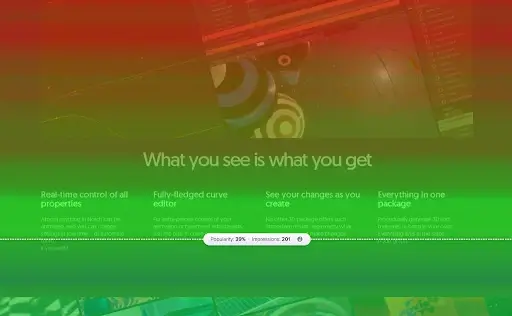
To begin with a technical definition – a heatmap is a dynamic infographic that uses colour and colour intensity as a way of representing data. This data depicts user engagement and the areas of a website that users engage, or don’t engage, with. If an area has an intense visualisation of colour on a specific area, then that area, or element is well interacted with. If the area is free from any colour spots, then it’s likely users are not engaging much with that area at all.
There are various heat mapping tools at our disposal; Hotjar and Microsoft Clarity are amongst the tools that we use here at Uplift – but there are loads of other tools out there!
So, why are heat maps important? Well, to put it simply, they provide the ‘next level’ of data beyond quantitative data sets such as those you’d find in Google Analytics. Whilst Google Analytics can tell you which pages users are finding popular on your site – it can’t tell you (by default) which areas of that pages users are engaging with. That’s where heatmaps come in! They provide a simple and accessible format for us to see which areas of a page users are most likely to engage with, and from there – we can then identify the areas of content or functionality that users are missing.
What Do We Learn From Heatmaps?
There are different kinds of heat maps that you might have heard of – the most common two are scroll maps and click maps.
A ‘click’ heatmap shows us the most interacted with elements on the webpage, and by proxy, the least interacted elements. We can see where users are clicking, and importantly, we can filter this too. The most common filters we might apply to these could be traffic source, time of day, or technological considerations such as device type. This allows us to filter and segment the user behaviour, so we can not only see how all users are interacting with our page, but we can see specifically how PPC traffic on a weekend might behave, and compare how that could be different from PPC traffic during the week for example.
Scroll Maps allow us to view how far a user is scrolling down the page. Scroll maps can be particularly important, because they can show you what percentage of your website’s visitors are seeing key messages or pieces of content. For example, we recently worked with a client who had a sales and promotional banner around two-thirds of the way down their homepage. Through scroll maps, we were able to see that – on average – only 18% of their audience was ever reaching that far down the homepage. This meant that 4 out of 5 visitors completely missed their sales and promotional messaging – an easy area for optimisation!
Through heatmaps, we are able to gain great insight into the user journey which we otherwise would not have access to. Not only do we learn valuable information about the webpage overall, we can see how users interact across different devices, for example – an element may be interacted with well on desktop but have minimal interactions on mobile. Heatmaps allow us to be able to identify barriers and obstacles that might be putting a visitor (and potential customer) off.
What Do We Do With The Information We Gain?
The overall aim for the insights we gain is optimisation, improvements to the user journey and as a result – an increase in conversions.
After identifying any problem areas or opportunities for improvement we can use the insights we’ve learned to put forward a hypothesis to the client. It might be to move popular elements, or elements that we want to be more popular, around the page to have more visibility and gain more interaction from the user.
Likewise, for the least popular elements, we can move them, especially if they are taking up valuable page space that would be otherwise beneficial to another element. Quite often, we might move a particular element to ensure it is being seen by the user – it’s important that our visitors are seeing our most impactful, engaging content, and that’s an easy area for optimisation if we find it’s not being seen by many users!
If you’d like to find out more about heatmaps, or would like Uplift to conduct a UX audit of your site, get in touch today.
WRITTEN BY
Hayley Roberts
UX RESEARCH & DESIGN MANAGER


