

Insights
The Impact of User Recordings on Web Design Decisions
August 4, 2023

Written by:
What are user recordings?
User recordings show first-hand how users interact with your website, they eliminate any assumptions we may have about user behaviour and provide unbiased evidence to learn from. The recordings allow you to view how the user moves their mouse, what they click on as well as what they might skip over and don’t engage with. They often help to highlight any issues or frustrations users could be experiencing on your site.
The value these recordings can provide to UX teams
These recordings can be invaluable to UX research and design teams as they help us discover issues and gain ideas of how we can improve user experience which ultimately can lead to an improvement in conversion rate.
Examples of what we might spot
Some user recordings may show that your users are using your website exactly how you expected them to. More often than not however there is always something we can spot and learn from.
-
Bugs which require fixing
-
Broken links or buttons
-
Elements not behaving the way the user expected them to.
-
Users quickly scanning through the elements on the page before quickly exiting the site, which could show that the user didn’t find what they were looking for.
-
Pages not being visual or engaging enough and users exiting the page.
-
Call to action buttons not being clear enough or users getting stuck in a flow.
-
Navigation unclear or users struggling to find pages.
-
Issues with main conversion points such as the checkout process or form fields.
How we can use recordings to inform web design decisions
Once we have spotted and interpreted any pain points from the user experience it is then up to UX Research and Design teams to come up with a solution. Bugs and broken links can be fixed in development whereas lack of engagement on a page or problems within the checkout process require more thought and planning.
To show this process we will talk you through a case study, where we evaluated user recordings of the checkout process of a client in the healthcare industry.
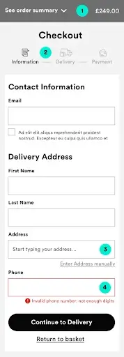
-
Order Summary
Problem: Once users got through to the checkout process they couldn’t see a summary of what they had ordered until the payment page. This could have been a factor of people abandoning the page due to them not being able to see a summary to reconfirm what they were checking out for.
Solution: We designed it so that every page of the checkout had the summary visible.
-
Checkout Steps
Problem: The form wasn’t broken down into steps so users had no idea what would be required of them upfront.
Solution: We broke the form into 3 steps which were clearly labelled so the user would be really clear on what would be required of them at each step, making this a more pleasant user experience.
-
Address
Problem: The recordings showed users getting frustrated with having to put their whole address in manually.
Solution: We introduced a postcode lookup to the form as default but still allowed users to enter their address manually.
-
Error validation:
Problem: The error messages when users were inputting the wrong information weren’t clear enough which led to users getting frustrated.
Solution: We clearly stated what was required by the user if the information was inputted incorrectly.