

Featured Case Studies

Amidst a competitive market, Cosatto sought to optimise their Shopify website to improve user experience and increase conversion rates.
We undertook a comprehensive analysis of the existing website structure, focusing initially on three key areas; the site’s navigation, Product Listing Pages (PLP), and Product Detail Pages (PDP).
Leveraging user-testing and data-driven insights to understand Cosatto’s target audience, we identified friction points and opportunities for improvement, which we incorporated into our new page template designs.

By simplifying site navigation and improving product discovery.
Increasing engagement and conversion rates.
Prioritising product categorisation, reducing bounce rates, and enhancing overall usability.
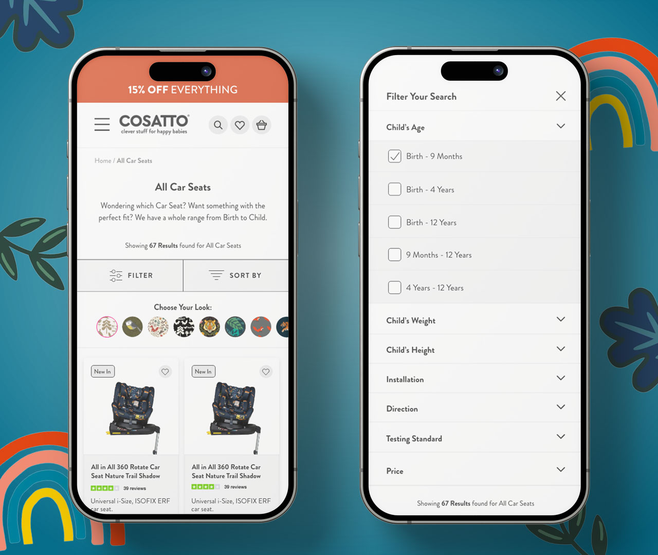
Our UX and CRO team designed a streamlined navigation system, reorganising categories and subcategories to improve user flow and simplifying the overall experience to improve product discovery.
Additionally, we revamped the PLP layout, highlighting key product information and integrating user-friendly filtering options.
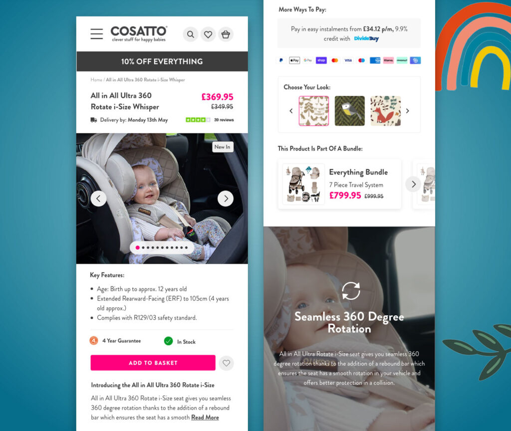
For PDPs, we focused on prioritising key information within the top-fold, featuring three key Unique Selling Points (USPs), the product price, design type, product reviews and a clear Call to Action (CTA) for purchase, with information available regarding payment type and delivery information.
Our design approach prioritised clarity, consistency, and ease of use, all with the aim to increase conversion rate.